1,在移动端和pc端,有时候需要要求对页面做一定的自适应配置,这时候需要在viewport中添加一些配置
<meta name="viewport" content="width=device-width,initial-scale=1.0,maximum-scale=1.0,minimum-scale=1.0,user-scalable=no">
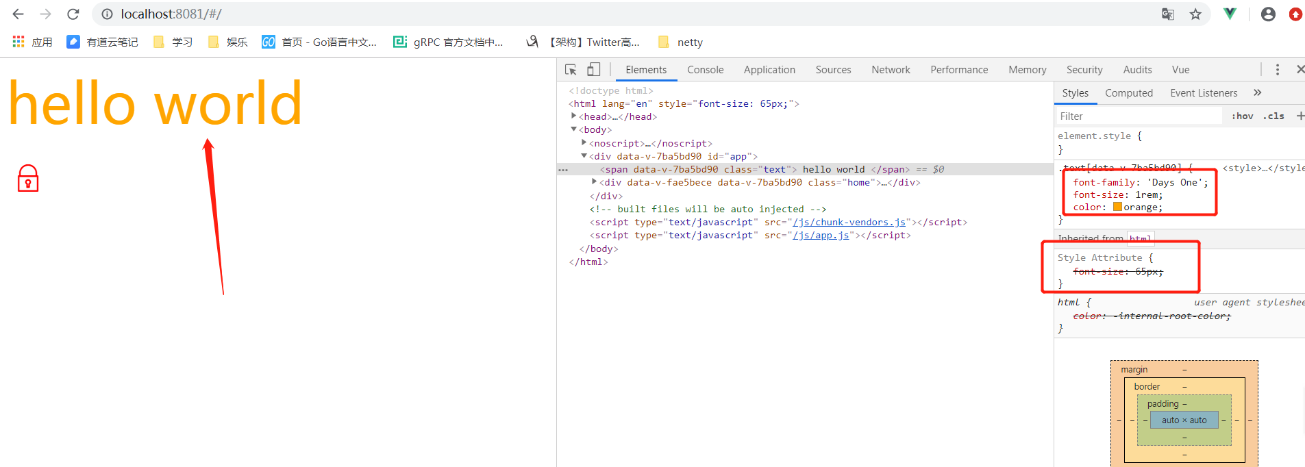
2,引入rem
引入rem的作用是适应自适应布局
document.addEventListener('DOMContentLoaded',()=>{
  const html = document.querySelector('html')
  let fontSize = window.innerWidth / 10  // 表示当前列宽的10分之一
  fontSize = fontSize > 50 ? 50 : fontSize   // 如果字体超过50px,则字体大小为50,否则为宽度的10分之一
  html.style.fontSize = fontSize + 'px'
})
使用:
<style scoped>
    .text{
        font-family:'Days One';
        font-size: 1rem;
        color: orange;
    }
</style>